


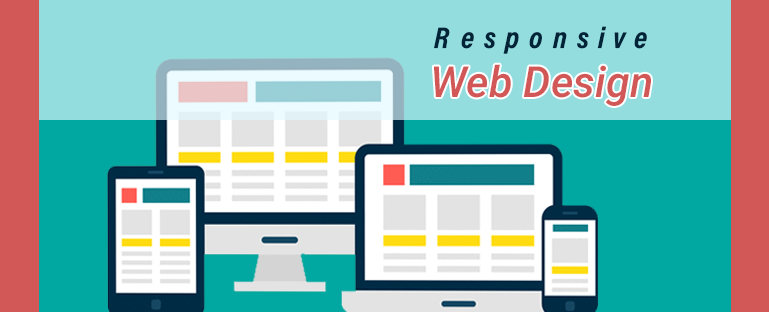
Responsive web design uses to make web pages look nice on each device. Responsive web design (RWD) allows design and code to respond to the size of a screen of the device. From this blog you will get 10 tips for responsive web design toi make responsive your website.
Responsive Web design allows design and development to respond to the user’s behaviour and environment based on screen size, platform, and orientation, whether you are browsing from your PC, your laptop, your tablet, or your smartphone. The responsive design promises to scroll, pann, zoom, and, most importantly, to confuse minimally. It makes everybody’s experience fun, no matter what computer they’re using to visit your content.
Here are some of our best tips for responsive web design which help every Web Application Development Company:
Tip#1 Start with the Mobile-First Approach
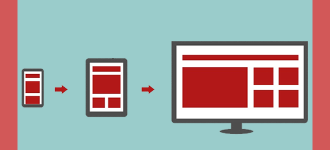
The number of mobile internet users in 2016 has surpassed the number of people who use the internet on their desktop and now you can imagine how many mobile internet users will be in 2019. So you have to start with a mobile-first approach if you’re talking about creating a website. Responsive design enables developers to create websites that can be tailored to all screen sizes and devices. A mobile-friendly website can view the content like photos and videos in a manner that makes users feel relaxed.
Tip#2 Flexible Grid
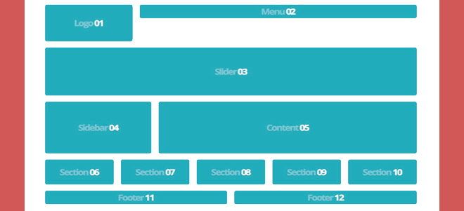
The grid is a significant element of responsive mobile-friendly interface design. The site’s fluid grid helps you to ensure the mobile web design is versatile and scalable. Here you can examine different elements such as proportion, clear spacing, or the resolution of the displays. The grid’s versatility has a direct relationship to website responsiveness.
Tip#3 How design works with different browsers

We cannot disregard various browsers other than the good display of your website on mobile devices and desktops. The difference in browsers can also influence how your website can view, so we’re also testing the design on all big and necessary browsers.
Tip#4 Think about images

You need to think about how an image will scale. Images play a significant role in the design of your website. They will help you emotionally interact with your visitors and allow them to imagine the product they are interested in purchasing. As such, it’s important to optimize your images for the site. Sizing photos can be one of the most difficult aspects of responsive web design. In your CSS, you will need to build guidelines that specify how images are viewed on various screens — whether rendered to be the maximum width, or omitted, or treated differently.
Tip#5 Use only the words you need

Desktops allow for more text. This isn’t always a positive thing. With mobile devices, you have to work within the confines of smaller screens. That means writing more efficiently, making sure every word helps push the story forward.
When you are writing from a web device, some editing may be required. Consolidate the copy, using the spots and other structural tools, and change the fat wherever possible.
Tip#6 Adopt Frameworks

If you add a responsive website to your workflow, you will save a lot of time creating a responsive website. If you want to build quick, static websites, an HTML framework like Bootstrap used in an HTML template is a nice starting point!
You can also take advantage of premade responsive WordPress themes if you want to make a website more complex and to include a blog in your marketing plan. These frameworks are also a great choice if you aren’t an accomplished coder but want to do it all yourself.
Tip#7 Make Proper Planning of Content
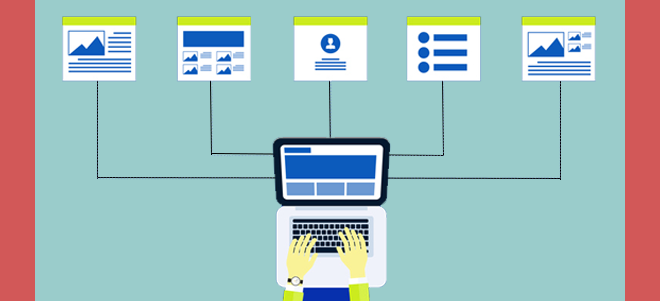
Content planning is also the highest priority for responsive website design. Creating a responsive web design is the ideal time to make content on the website more readable and accessible, no matter on which platform it is displayed. You will chart the order the website material will appear at the smallest browser width on every tab.
Tip#8 Think about Navigation

Navigation is important on mobile. There are several common methods for collating large menus and content. If you’re building a website, your goal should be to create a website that will have a good user experience. See how the website navigates when creating a website. If you are from the history of web design, you must be conscious that navigation is the key. This helps to connect your visitors with your website to see your goods and/or services. You need to create a simple navigation experience for your audience when developing a responsive website.
Tip#9 Perform Regular Testing

Any site needs daily monitoring to make sure no updates and improvements are required. By performing regular testing the chances of errors and bug on the website will reduce. You need to be sure of the sensory experience of your website is working on every computer. Spend some time surfing there, playing with your app, or running A / B tests to enhance it.
Tip#10 Make Buttons Clickable on Smaller Screens

Don’t forget to pay special attention to the website’s buttons. Buttons are critical elements of every website. You should render buttons smaller when adapting your website to smaller screens so that they can fit on the screen. Remember that making them smaller makes them more difficult to press too.
Last Words…
Dreamsoft4u Pvt. Ltd. is a leading Web Application Development Company in India. We provide robust web application development services that range from basic landing pages to complex customized web solutions helping our clients achieve competitive advantage. We have an excellent team of web development services experts who designs and develop websites that help companies grow revenue faster and make your website the most effective online selling tool. Want to reach us then contact us: (+1)-949-340-7490 | Mail at enquiry@localhost
Want to reach us then contact us: (+1)-949-340-7490 | Mail at enquiry@localhost


